Sharp SmartCentral
designing a content-focused TV UX experience
About this project:
Context:
RKS / 2013
Type:
- Interaction Design
- Visual Design
- Strategy
- Project Management
A content-first approach
Sharp's SmartCentral platform needed an update to compete in a category that was quickly evolving.
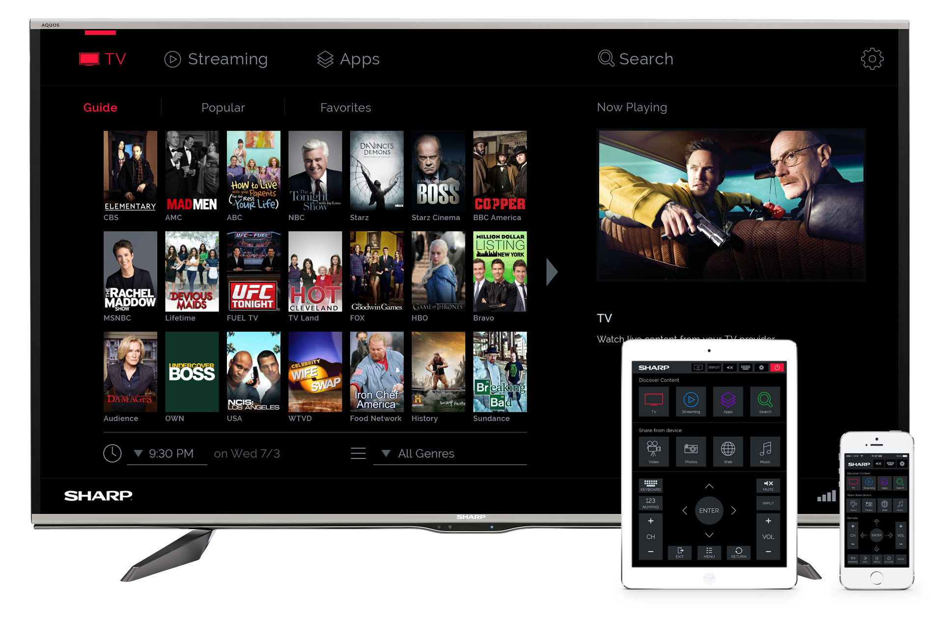
What is a “smart” TV? Where most smart TV platforms revolved around apps, RKS redesigned the SmartCentral platform with a focus on content. The goal was to get people to the TV shows and movies they love, no matter what the source is.
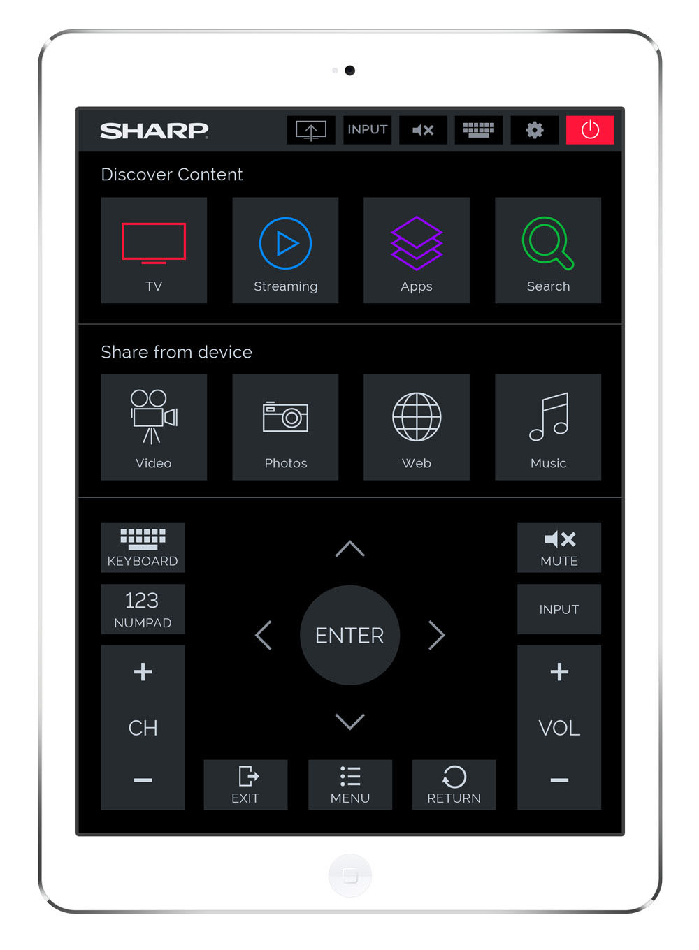
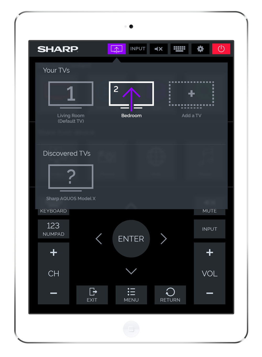
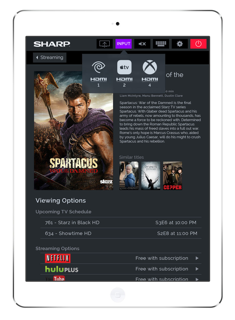
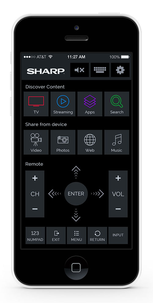
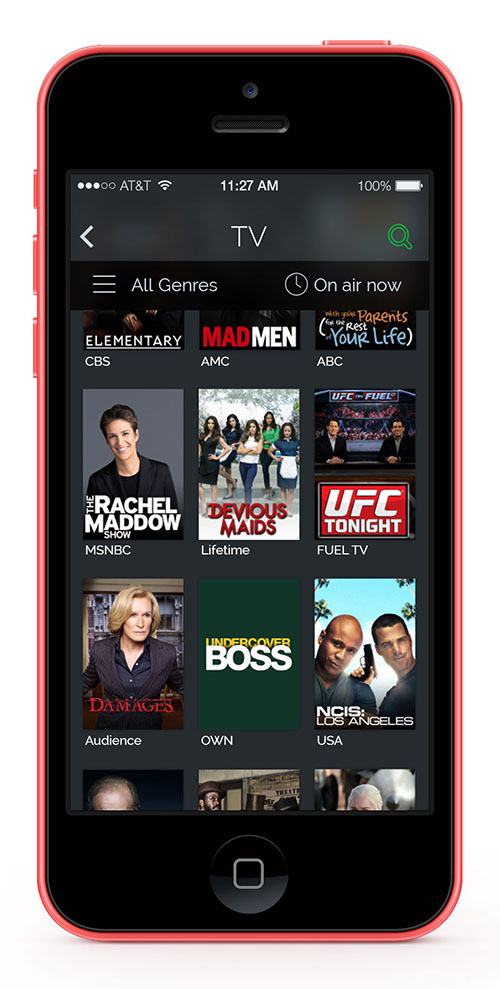
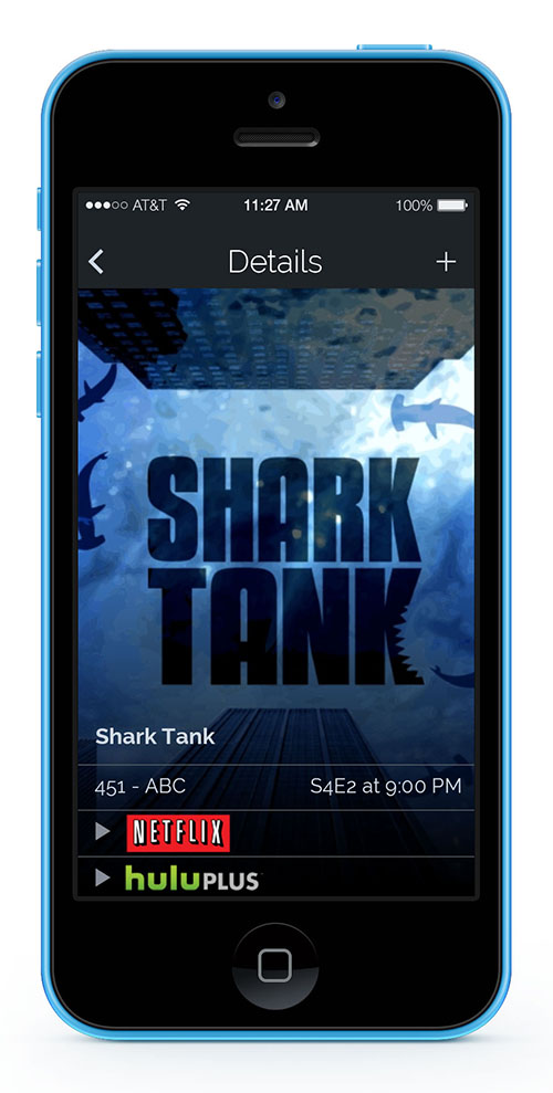
The accompanying SmartCentral mobile applications for both smartphones and tablets allow users to browse the same catalogue of content available on their TV directly from their mobile device. The app can then tell the TV to switch to the desired content, all without picking up a remote control.
I managed the project for RKS and led the design effort. Starting from basic requirements from the client, I created detailed wireframes, visual layouts, and production ready visual mockups of the TV and mobile app UIs, along with a document specifying functionality and interaction.
TV UX and UI design
After defining our content-first approach, we began to construct the TV UI around the core unit of content: the artwork available through Sharp's content partner.

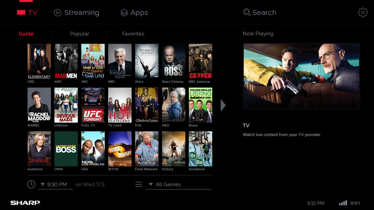
The main screen shows what's on now in a visual grid, allowing the user to select something to watch without digging deep into the UI
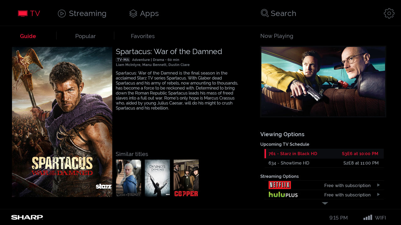
Selecting a TV program brings up the details screen, which gives more information about the show, and allows the user to choose when to watch it and what service to use.
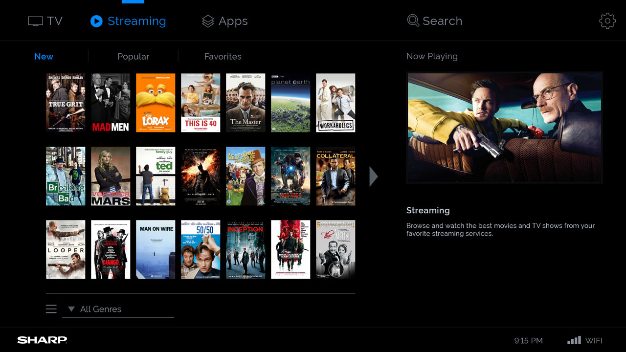
The Streaming screen, similar to the main screen but for OTT content available through services like Netflix.
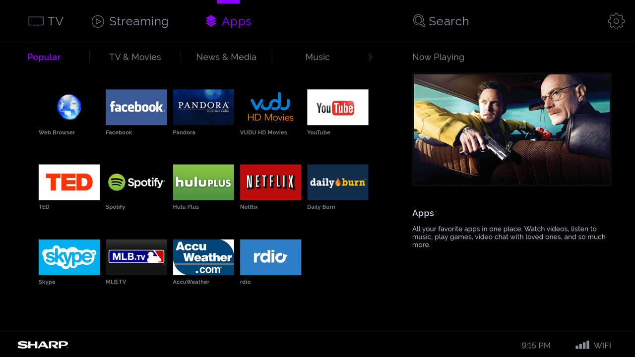
There are several apps available on the TV, so users have the option to use the native Netflix UI if they prefer.
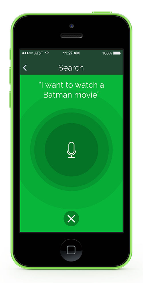
Search is global, searching for whatever is typed across live TV and Streaming content.
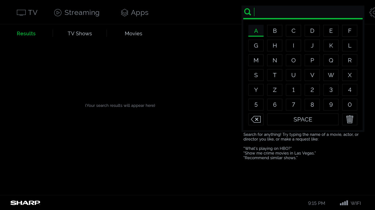
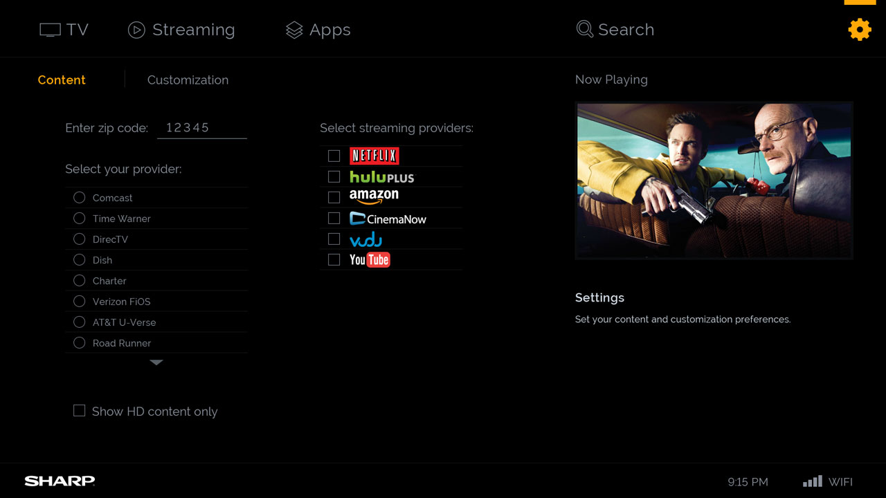
Users can adjust the settings to allow for some level of personalization, without complicated user profiles.
Sharp’s user interface is attractive and simple. The TV-show artwork that populates its guide looks fantastic, with helpful additions like upcoming episode schedules and similar titles offered on the same screen. Apps are laid out in a logical order, and on the whole it’s easy to find what you’re after.
The Verge — IQ Test: The State of Smart TVs at CES 2014

Mobile App UI
In addition to the TV UI, I designed a mobile app experience that is also content-focused. The goal was to allow users to have a seamless way to display content from their phones on the TV itself.
