Flowater
designing and branding for a premium alternative to bottled water
About this project:
Context:
RKS / 2013
Type:
- Industrial Design
- Graphic Design
- Branding
- Project Management
Elevating tap water
FloWater came to RKS with a mission: end bottled water. To do this, FloWater is targeting the bottled water consumer: those who don't like the taste of tap water, who want high-quality, purified, enhanced water.
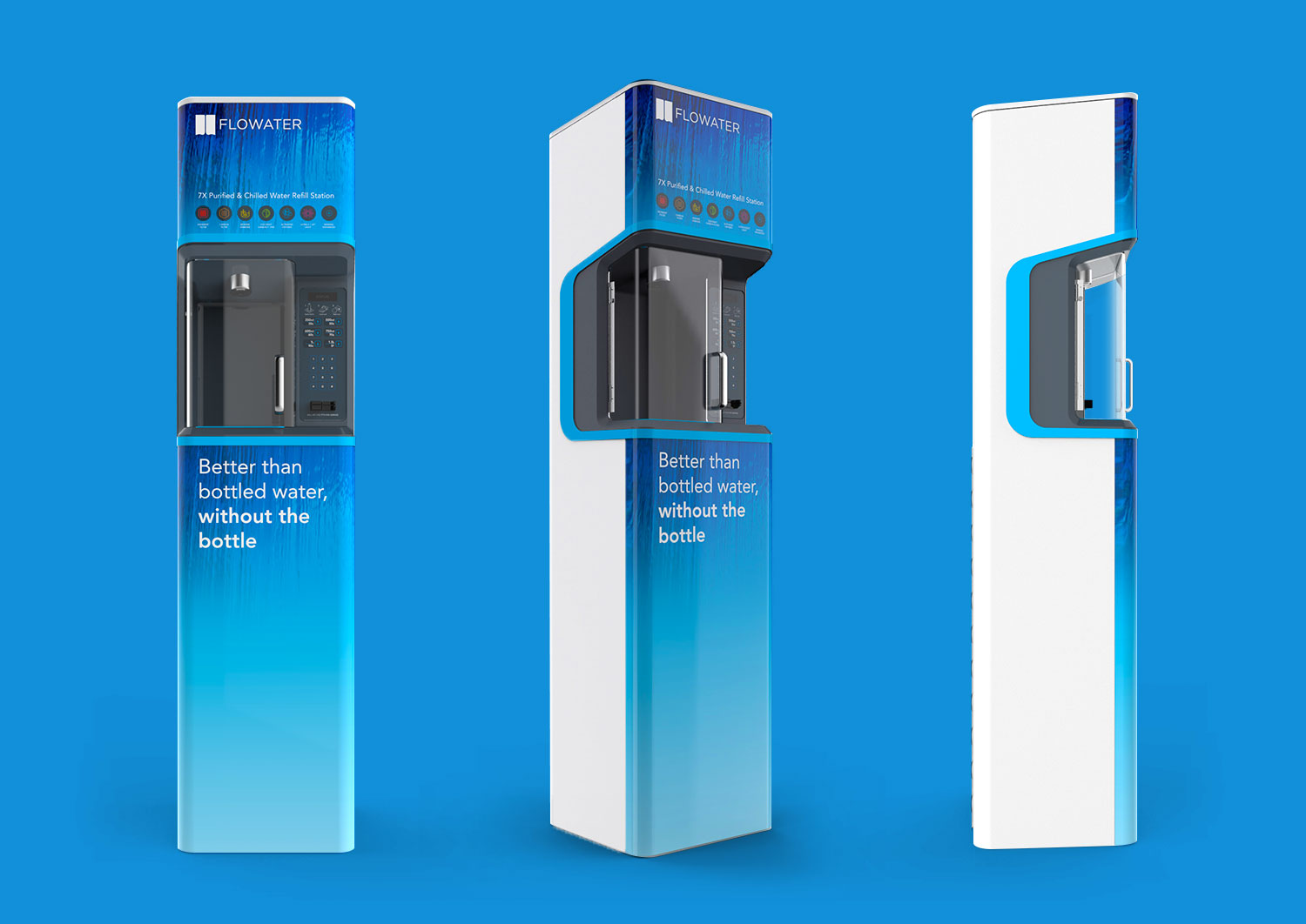
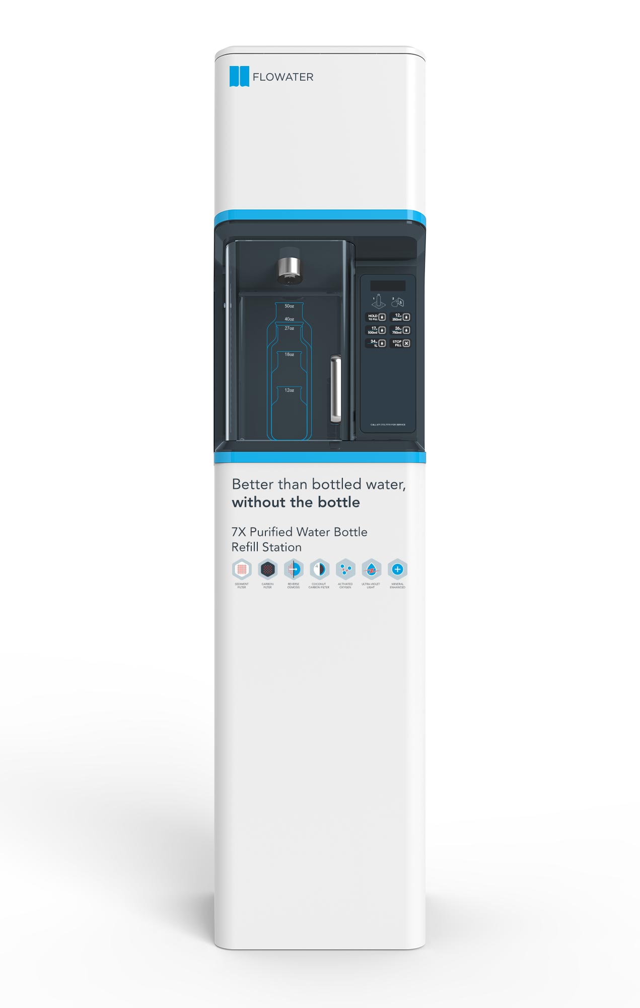
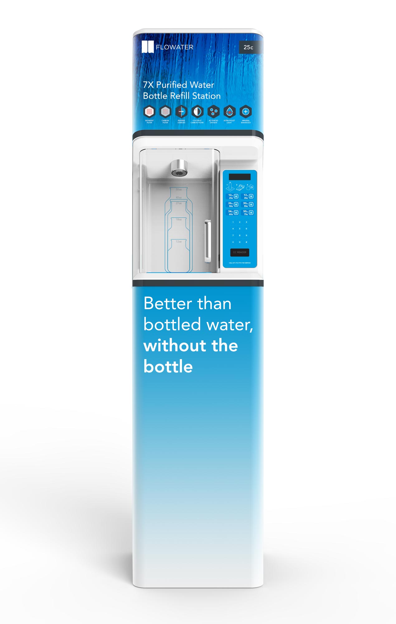
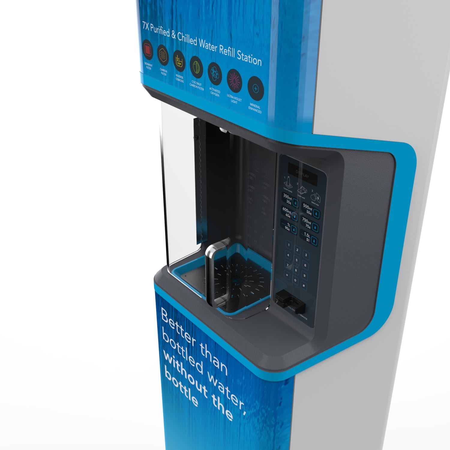
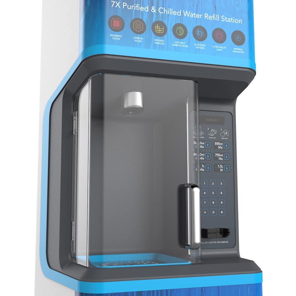
RKS undertook the redesign of the FloWater refill station, factoring in ergonomics, messaging, and hygiene. The design consists of a tall, eye-catching white pillar, with a fill zone carved out of the front side, inviting you to fill your bottle with refreshing, 7X purified and chilled water.
RKS also created a visual brand identity for FloWater. The logo avoids water drop clichés, yet captures the movement and energy of flowing water. The colors and imagery are chosen to convey a water that is pure and refreshing.
My role for this project was project manager and design lead. I worked with the client to understand their needs, led the research into the market to identify opportunities for both the product design and the brand, and worked with the industrial design and branding teams to create a holistic, unified product and brand.

Industrial Design
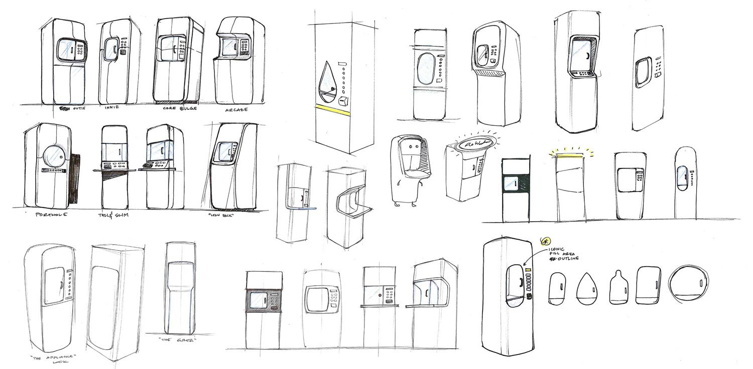
The refill station had to be an ambassador for the FloWater brand: tall yet discreet, eye-catching yet elegant, refined yet inviting. Along with the RKS team, I created several sketches to explore a range of personalities and approaches for the unit.
Brand Positioning
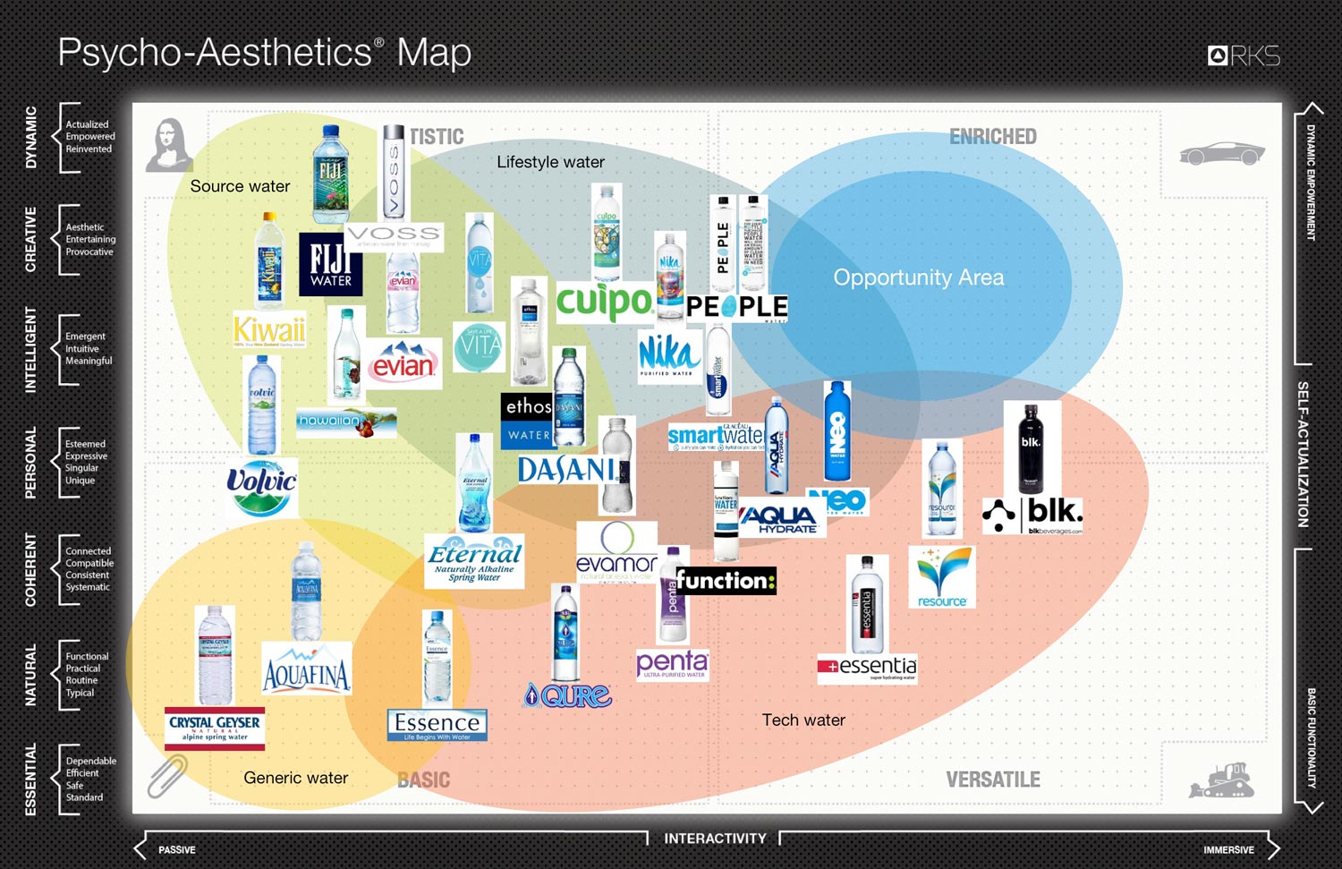
Our goal with the brand development was to position Flowater as a premium water option—like "Fiji water on tap." In addition to tasting better than the best bottled water, it is a sustainable hydration choice, eliminating the single-use plastic bottle waste of bottled water.
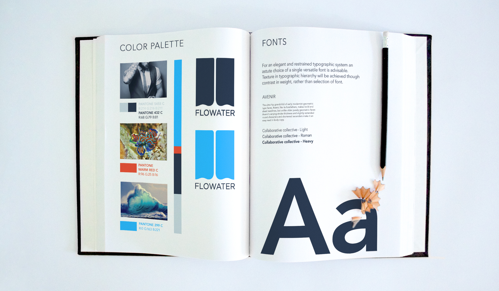
Brand Guide
FloWater started as a little startup going after the big bottled water companies. We strove to create a brand that balanced both the rebellious nature of the company's mission with the purity and quality of the water itself.
To achieve this harmony, we developed a simple yet powerful logomark, and combined it with bold typography and powerful colors.
Icons
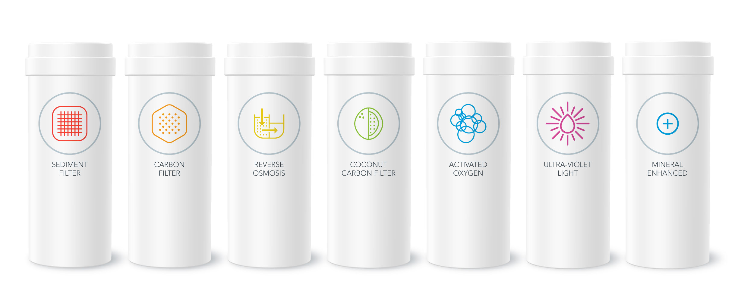
The FloWater refill station features state-of-the-art technology for purifying regular tap water, and we wanted users to know about it, so we created a set of icons to represent each step.
