STATE / CHANGE
branding and identity for the SVA MFA IxD 2018 thesis show
About this project:
Context:
SVA / 2017
Collaborators:
Type:
- Branding
- Motion Graphics
Design never sits still
Being part of the MFA Interaction Design program at SVA was a privilege, and a whole lot of fun. So when the opportunity came to help design the graphics for our end-of-year thesis festival, I jumped at it.
Naming the event was probably the hardest part. Names are difficult. As I heard recently from Benedicte Wildhagen of Norway's DOGA, "names are never wrong"—which makes it really hard to know when they're right. We started out with a Google spreadsheet of name ideas. After a few rounds of suggestions, voting, and discussion, we settled on STATE / CHANGE, which captures the idea that our thesis projects were responding to the ever-changing state of the world.
Establishing a visual language
The branding and visual design effort was led by my classmate Azu who has a graphic design background and a very refined typographic sensibility. We brainstormed ideas for the overall approach to the festival branding, looking at the work of Mitch Paone at Dia Studio and the experimental forms of Zach Lieberman for inspiration.
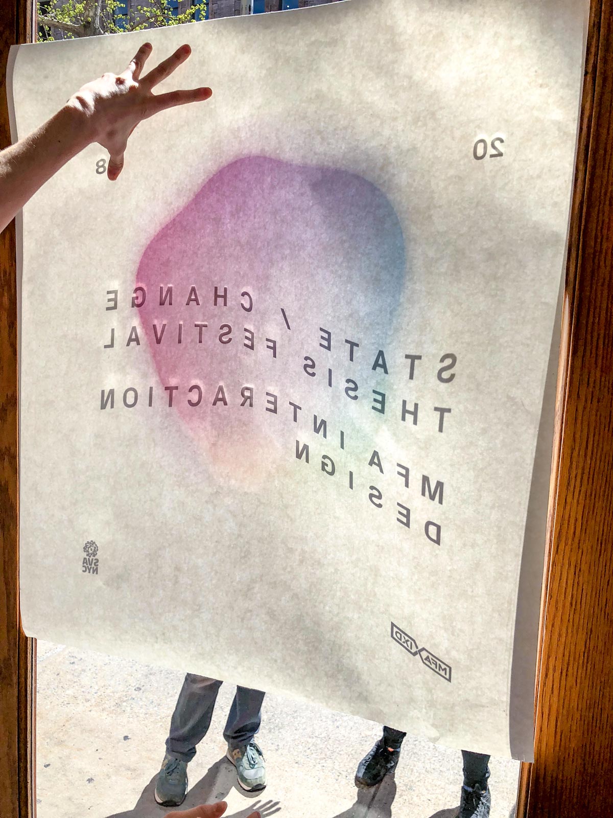
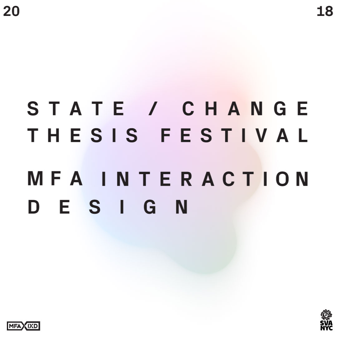
Azu developed a few overall aesthetic directions for the branding, and we shared them with the rest of the graduating class for feedback. People generally favoured a stark typographic treatment combined with soft, colourful supporting graphics.
Blobby is born
I was using Blender3D for some other projects at the time, and wanted to play around with an animated graphic for use with our branding.
Early tests were pretty good, and with feedback from Azu I refined the design to have more of a contrast between soft and hard edges, and to go for longer before it loops.
Blobby in application
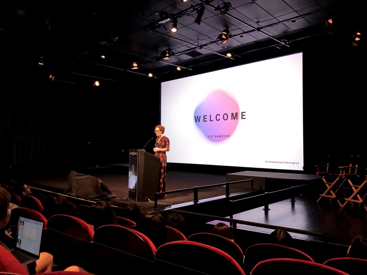
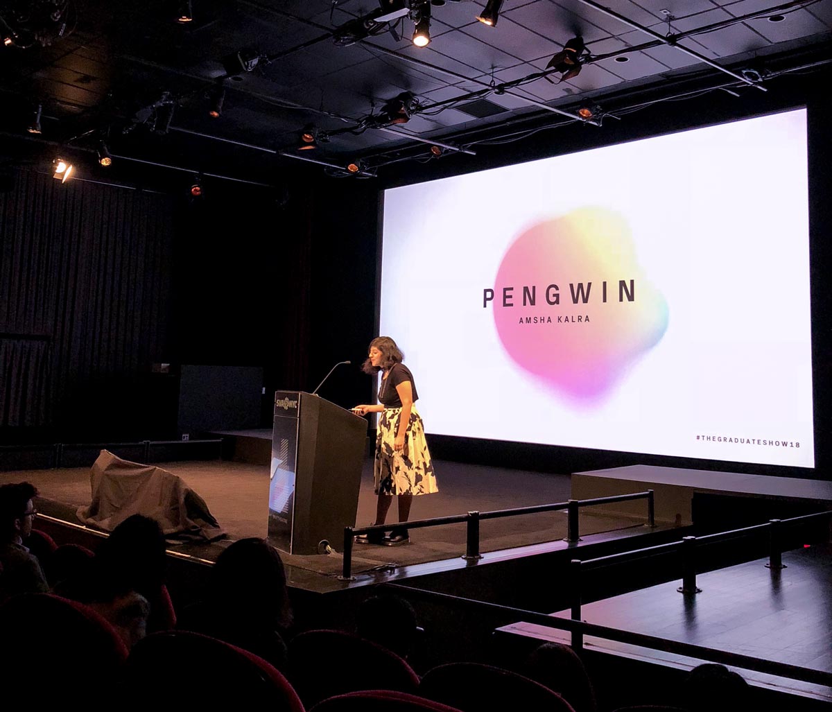
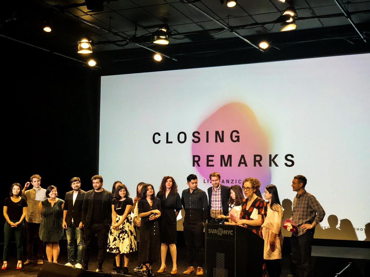
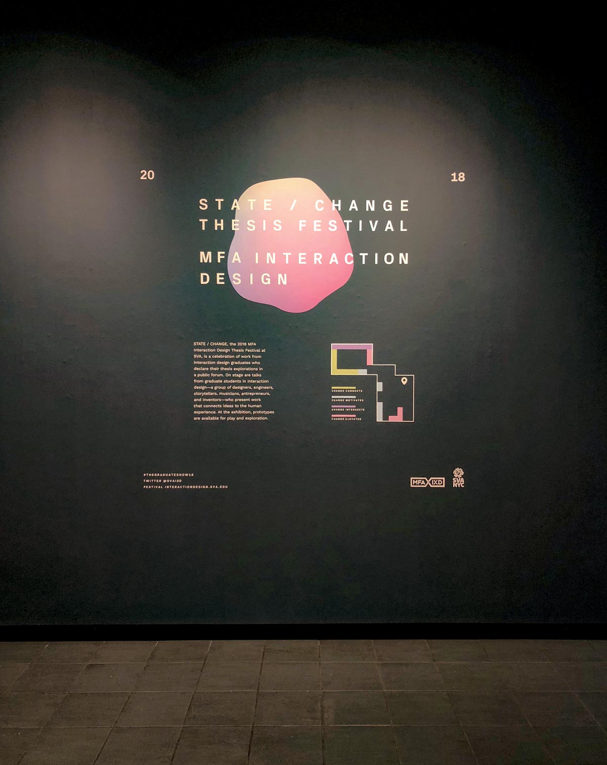
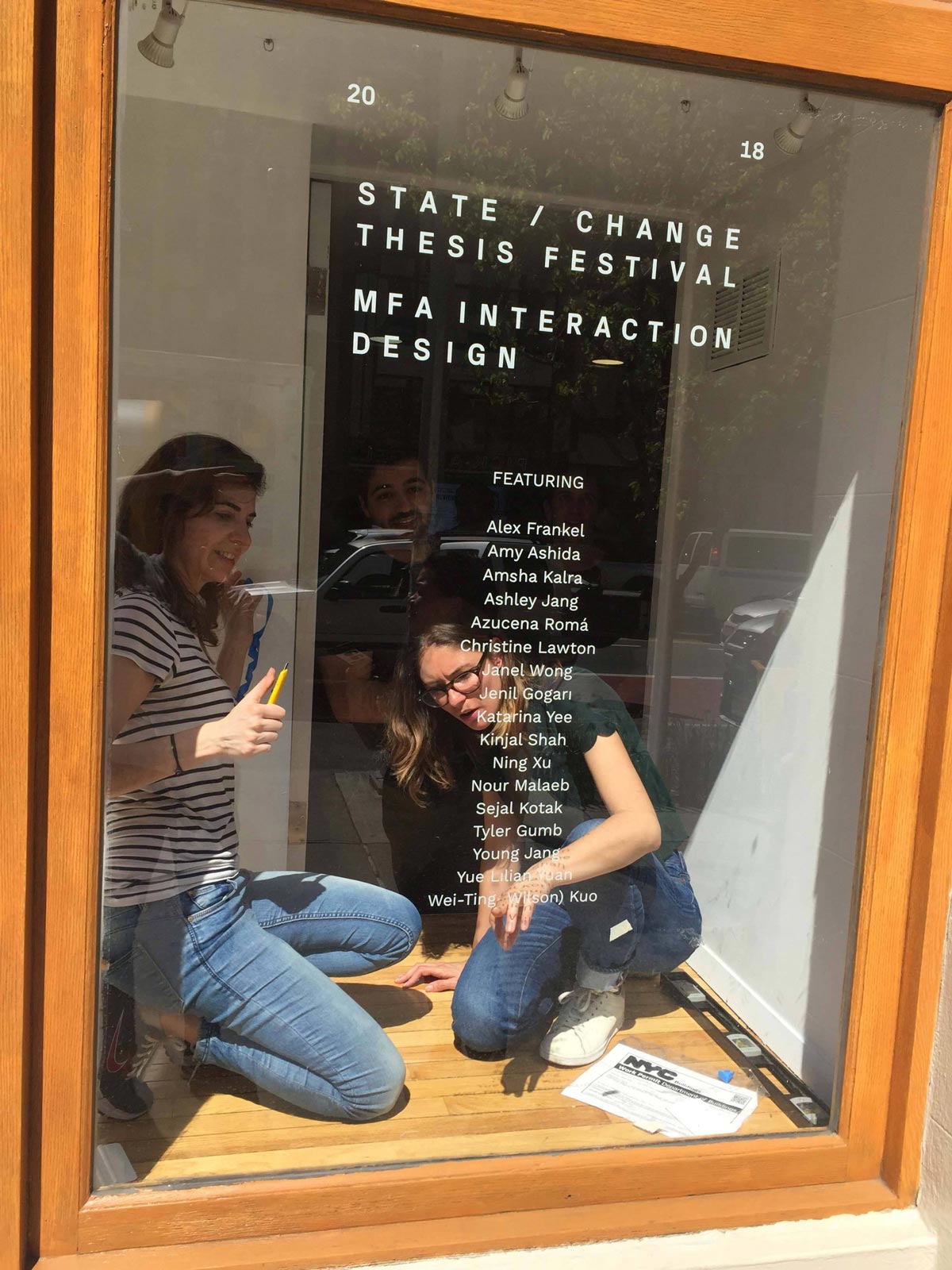
The combination of type and blob graphics was used in informational materials, environment graphics, wayfinding, and in the festival program. The animated version was used as the backdrop for transition slides used in the festival.
